Factorization of MSI data - part 1
This post is part of our series titled "Unsupervised learning on MSI data", which contains the following entries:
1. Factorization of MSI data - part 1 (current post)
2. Non-negative matrix factorization in MSI
Table of contents
- Introduction
- Matrix factorization in a nutshell
- Principal Component Analysis (PCA)
- Varimax
- Independent Component Analysis (ICA)
- Conclusion
Introduction
Unsupervised data analysis is primarily targeted at exploring the content of the data, and extracting the trends present in a mostly unbiased way. In contrast to supervised methods, these methods do not require any labelling or prior information on the data. When such information is available, (semi-)supervised methods are generally the recommended way to go. If you are not yet familiar with MSI technology and its associated data, please refer to our introductory post on MSI data analysis.
INTRODUCTION TO MSI DATA ANALYSIS
We recently published a review paper on unsupervised analysis of MSI data together with profs. Raf Van de Plas (TU Delft) and Richard Caprioli (Vanderbilt University). For in-depth information about the topics we touch upon in this blog series, please consult our review paper and its references.
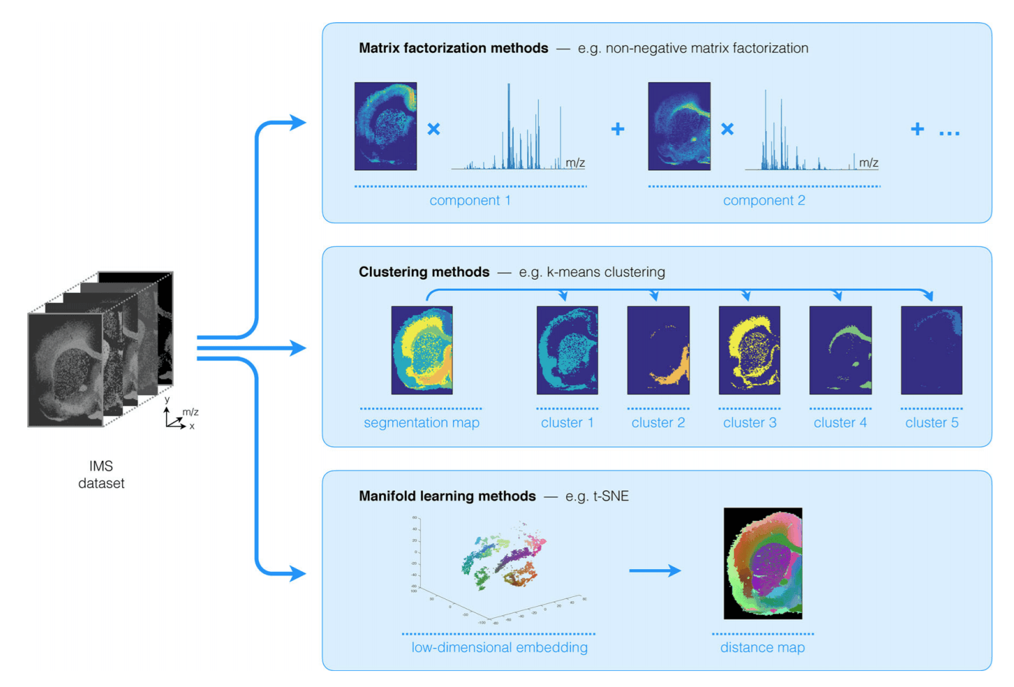
A wide array of techniques has been used in the unsupervised analysis of MSI data, which can broadly be broken down into 3 main categories, namely factorization methods, clustering methods and manifold learning or non-linear dimensionality reduction techniques, as shown in Figure 1.

In this post, we will focus on factorization methods without non-negativity constraints on the results. Furthermore, as Aspect uses Python as one of its main foundations, we will limit ourselves to methods that are readily available in the Python ecosystem. We will focus on non-negative factorization methods in one of our following posts, so stay tuned for that.
We will demonstrate our selected methods on a MSI dataset acquired in human lymphoma tissue using a Bruker rapifleX MALDI Tissuetyper instrument. The experiments focused on lipids with 2,5-DHB matrix deposited by sublimation. A sampling resolution of 10 μm was used, collecting around 500.000 pixels. We focus on the m/z range of ~ 600-1200 totalling 8000 ion images per tissue. Below, we will apply PCA, PCA + Varimax, and ICA to this dataset.
Matrix factorization in a nutshell
Matrix factorization techniques are an important class of methods used in unsupervised MSI data analysis. Matrix factorization methods take a large and often high-dimensional dataset acquired by a MSI experiment (or several experiments), and decompose it into a (typically reduced) number of trends that underlie the observed data.
These approaches are applied to the matrix representation commonly used for MSI data sets, as discussed in our introductory post on MSI data analysis. When representing MSI data in matrix form, D is a data matrix where rows denote pixels and columns denote m/z bins. Hence, for a single MSI data set, m is the number of pixels and n is the number of spectral bins or m/z bins, i.e. each row of D represents the mass spectrum of a pixel in the sample along a common m/z binning
Specifically, all matrix factorization approaches formulate a data matrix D∈Rm×n as the product of two factor matrices M∈Rm×p and N∈Rn×p, such that:
D≈MNT
where T denotes the matrix transpose operator. The differences between matrix factorization approaches stem from their underlying assumptions, potential constraints on M and N and how goodness-of-fit is implicitly defined within the objective function underpinning each approach. Very often, MNT is chosen to be a low-rank representation of D, i.e., p≪m and p≪n, thus leading to a latent dimensionality reduction and approximation of D.
The resulting reduced representation enables the analyst to gain visual insight into the underlying structure of the MSI data, and it often exposes the spatial and molecular signals that tend to co-localize and correlate (usually under the assumption of linear mixing). Furthermore, as these techniques can provide a lower-dimensional and lower-complexity representation of the original data, they regularly serve as a starting point for follow-up computational analysis as well.
Principal Component Analysis (PCA)
The first method we’ll show is Principal Component Analysis (PCA). PCA has been one of the bread and butter tools for the analysis of MSI from the start, and is still probably the most widely applied factorization method in MSI (see review paper for an extensive list of references). PCA is a well-known factorization method that is widely used in other fields and is ubiquitous in machine learning in general. Seeing the importance of this method, we’ll use it to lay down some of the groundwork concepts for the other methods.
The goal of PCA is to reduce the dimensionality of a dataset, i.e. describe the dataset with a lower number of variables, while retaining as much of the original variation as possible given the chosen amount of variables. These new variables, called the principal components (PCs), are linear combinations of the original variables (intensities per m/z bin) and each PC is uncorrelated to all others.
The first PC is defined such that it captures the largest possible amount of variance in the data. Each subsequent PC is uncorrelated to the previous PCs and describes the largest possible variance that remains in the data after removal of the preceding PCs. Roughly speaking, this means that the largest trend in the MSI data will be captured by the first PC, the second largest trend by the second PC, etc.

PCA analysis can be written in the form of a matrix decomposition. Let us take our MSI data matrix D. PCA then decomposes D as
D=SLT
S is an m×p matrix with orthogonal columns, often called the score matrix, and L is an n×p matrix with orthonormal columns, traditionally called the loading matrix. Note that in PCA the exact equality holds as long as we retain all principal components, in which case there is no dimensionality reduction. We’ll explain how PCA works, and how it applies to MSI data below.
PCA applied to toy data
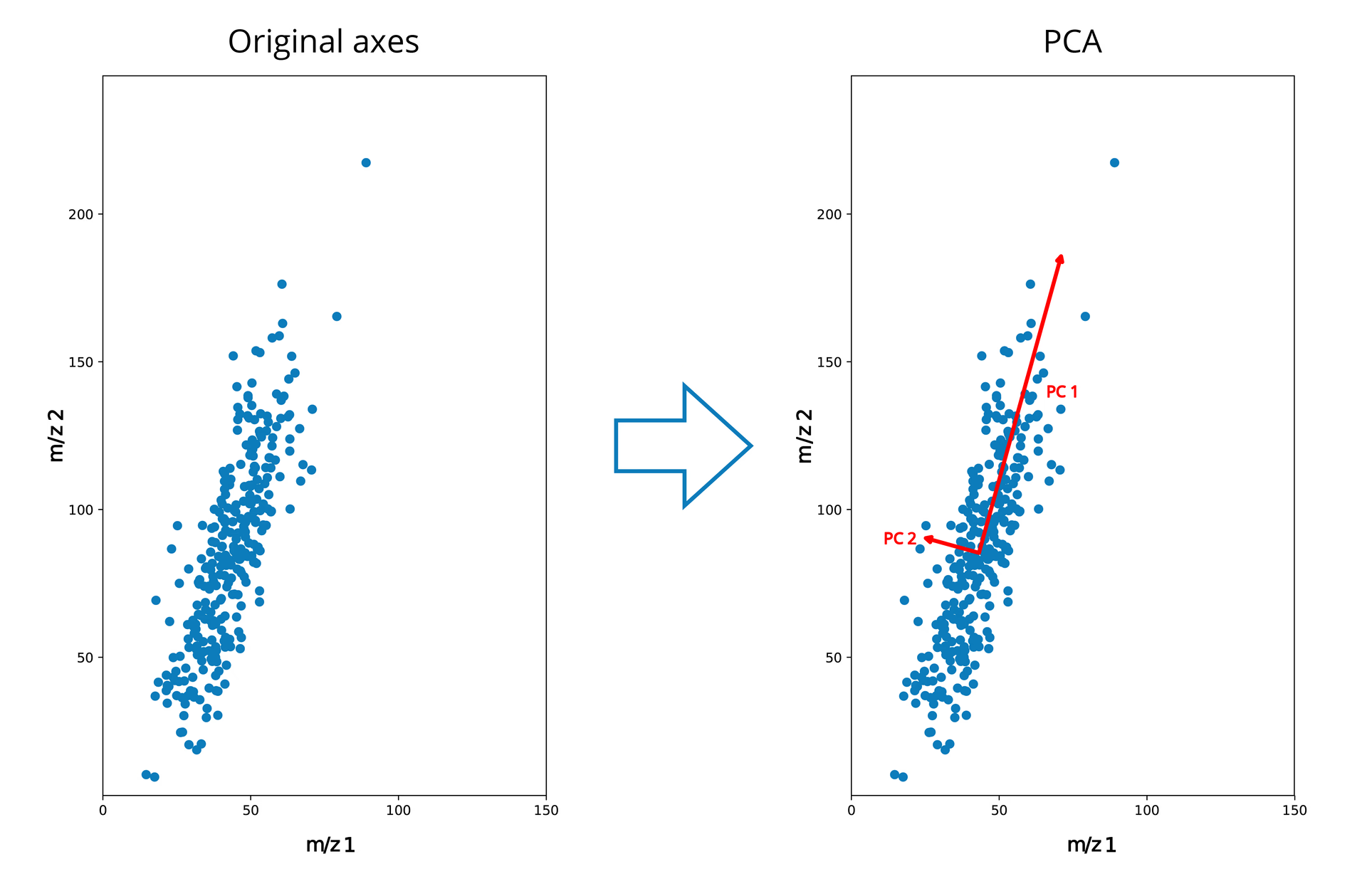
We’ll first illustrate PCA using a simple toy example. In Figure 3 we see a distribution of points in two dimensions. In this very simple example, let’s say that each point is a pixel in our MSI image, and that we only measured two m/z bins, where axis 1 and axis 2 represent the intensities measured for m/z bins 1 and 2 respectively. From this image we can see that there is a relatively large variance in the intensities along the axis of bin 2, and a smaller variance in the intensities along bin 1.
If we apply PCA to this simple example, we would get a new orthogonal set of axes, where the first axis (the first principal component or PC 1) follows the direction of the largest variance. In our case, the largest variation occurs along m/z 2, but still contains some influence from m/z 1 as the two are correlated – it is a linear combination of the two, where m/z 2 has the largest coefficient. PC 2 follows the direction of second largest variance, and must be orthogonal to PC1. In this simple 2D case, there is only one way the axis can be oriented due to the orthogonality constrains (except for a sign change).
If we are interested in the large trends in the data, we can discard PC2, and still maintain a lot of that variability in our original data. This said, we will lose the “information” along PC2 if we do so. In this simple case we can see that we probably would not lose a lot of information if PC2 is discarded, as that direction contains mostly noise.
Note that, while we started with all-positive data on axes 1 and 2 initially, the origin of the new orthogonal axes defined by PCA is placed at the center of where the variance occurs (mean subtraction). This will result in negative values when we project our data onto these new axes, which will be an important point below.
PCA on an image
Let’s now take an example a bit less abstract, namely a regular color image of another well known Principal. The image has 4 channels, namely RGB and a channel for transparency (A). This example can be seen as an MSI experiment with 4 m/z bins.
If we apply PCA to this image we get the result in Figure 4, where each column represents a different principal component. On the top, we can see the scores or here the spatial trends for this image (in false color images), and on the bottom we can see the loadings, which represent the relative importance of each channel.
From the first principal component, we can see that a lot of the relevant “information” in this image is immediately captured in the first principal component. Furthermore, we can see that the RGB channels are nearly equally important in the loadings, but that the transparency channel is pretty much ignored.
Then, in PC2 we see essentially the varation in the image along the transparency channel, with a clear localization of where the transparency channel is high. This is something that is also observed in MSI experiments where the area outside of the tissue is measured as well.
Finally, we see that PC3 and PC4 provide additional information, but focus increasingly more on smaller parts of the image. This also shows that the number of components that are relevant depend on the the goal of the analysis. If the goal was to recognize the character, we would have enough with PC1 alone, and could discard the other components, but we’ll come back to that later.

PCA applied to MSI data
When applying PCA to MSI data, the resulting score matrix S extracts trends in the pixel space, i.e. spatial trends (the singular vectors spanning the pixel space), whereas the loading matrix L extracts spectral trends (singular vectors spanning the spectral space) from the data. Figure 5 shows the 10 first principal components, with the spatial expression on the left, and the matching spectral expression on the right.
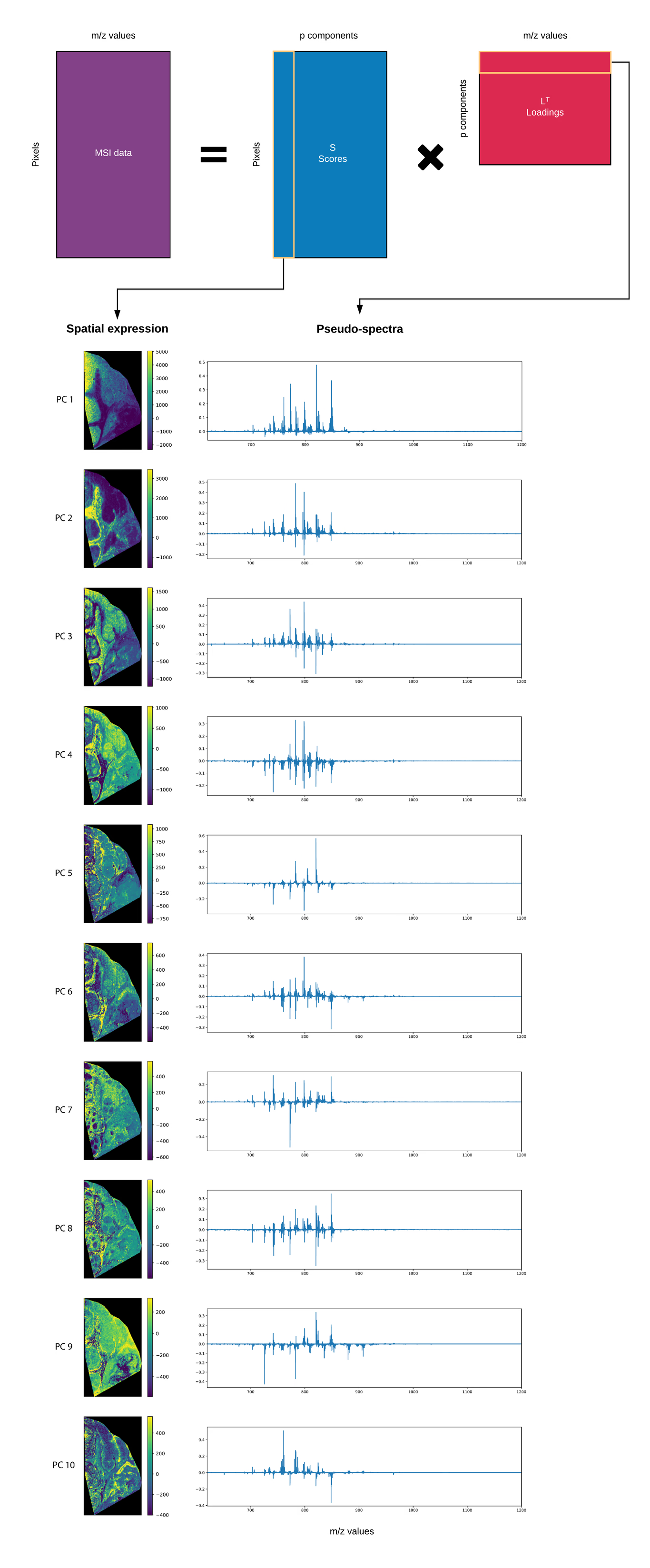
Looking at these principal components, we can immediately see various large spatial trends in the data, with different regions in the tissue lighting up, such as the connective tissues, the lymph nodes and necrotic regions, each with their respective spectral patterns. The spectral patterns are also sometimes referred to as pseudo-spectra, and represent the linear combinations of m/z bins that constitute the principal component. This pseudo-spectrum shows the biomolecular ions that are involved in the expression of the spatial pattern on the left, where each region has its own characteristic spectral fingerprint, i.e. its own set of biomolecular ions, which attests to the chemical specificity and richness of the biochemical information that is captured by MSI.
Interpretation
As a general rule, peaks that have a high absolute intensity in the pseudo-spectrum will have an important role in the spatial expression of the region highlighted by the principal component.
Some caveats must be made: ideally, this pseudo-spectrum would give a straightforward list of which bio-molecular ions are involved in each region from a biological sense. However, as we said before, the goal of PCA is to capture and summarize as much of the variation in the data as possible per principal component. This is not necessarily the same as correctly modeling the underlying biology or sample content. It’s a bit like you had only one sheet of paper to summarize an entire book and went a bit overboard. While it may capture the essence of the book, the end result might not be too reader-friendly or clear on what everything means.
One example of interpretability issues is the negative peaks that appear in the pseudo-spectra. These can be difficult to interpret from a mass spectrometry perspective as the original MSI data contains only positive values, namely the ion counts. Similarly, negative values appear in the spatial expressions of the components, making the information difficult to interpret. The issue of negative values in the resulting components is handled by techniques such as non-negative matrix factorization, which we will treat in a future post.
Furthermore, due to its eagerness to summarize the data, PCA has a tendency to pack as many m/z bins in the pseudo-spectrum as possible, making the pseudo-spectra difficult to interpret. As we’ll see below, techniques such as varimax can help in improving this issue.
Selecting the number of principal components
An important issue when using PCA is the number of components to retain. This is not just a problem for PCA, but for nearly any dimensionality reduction method, be it factorization or clustering. When using factorization in the context of MSI, we hope to get a much more concise representation of the original data by grouping together m/z bins that operate together, such that we end up with tens to hundreds of components compared to the original thousands to millions of m/z variables. In PCA, each subsequent principal component will capture less and less of the variation in the data until we end up with components that just capture noise. Identifying that cut-off point is difficult and there is no clear cut answer to this problem, however, an often-used method is the cumulative variance plot, which shows the percentage of variance that each additional component explains. This can be used to set a cut off point for how many components to retain, based on the amount of variance that is captured.
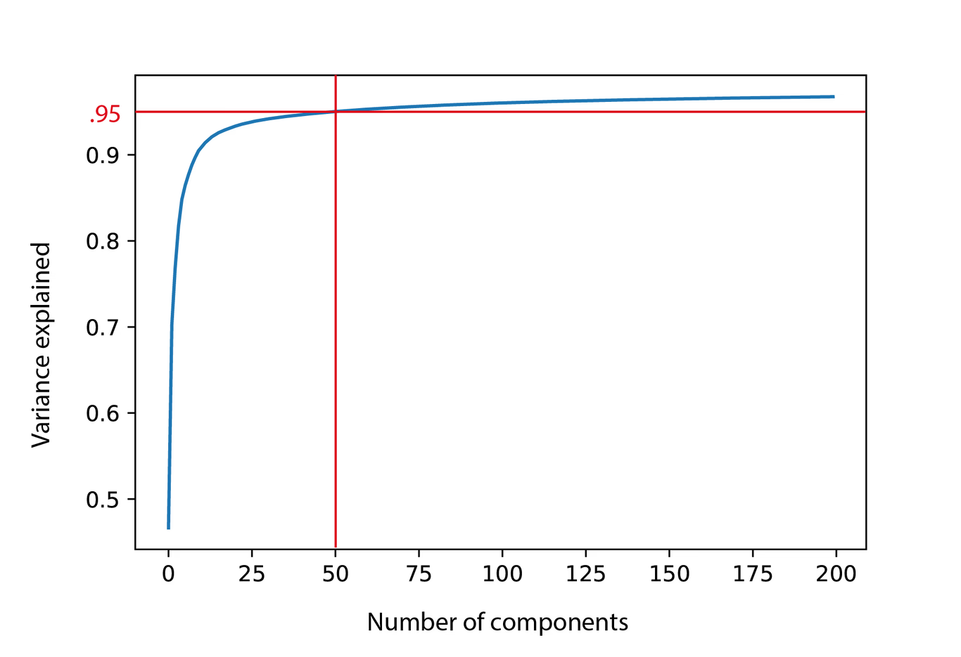
In figure 6, we see that for our lymphoma dataset, we can capture 95% of the variance by the first 50 principal components, which is a lot less than our original 8000 m/z bins. While this will definitely capture the most important trends in the data, biological signals can be relatively localized or low intensity, thun contributing relatively little to the variance. As such, it is generally recommended to visually check if there is still spatial structure in the spatial expression images after, in this case, the 50th component.
In summary, despite some of its shortcomings, PCA is a great tool to get a sense of the content of the MSI data, and is widely available in many different programming languages. Furthermore, it can often serve as an important dimensionality reduction step, prior to applying other algorithms, such as e.g. independent component analysis (ICA) or clustering techniques, due to its ability to capture as much of the original variability in the data as possible.
Varimax
PCA, as well as many other factorization methods, suffer from what is known as ‘rotational ambiguity’. Above we showed that the result of a PCA analysis is a new set of orthogonal axes onto which the data is projected. We can rotate these axes and still represent the same amount of information, i.e. there are an infinite number of ways in which we can orient the axes without losing any “information”, as is illustrated in Figure 7.
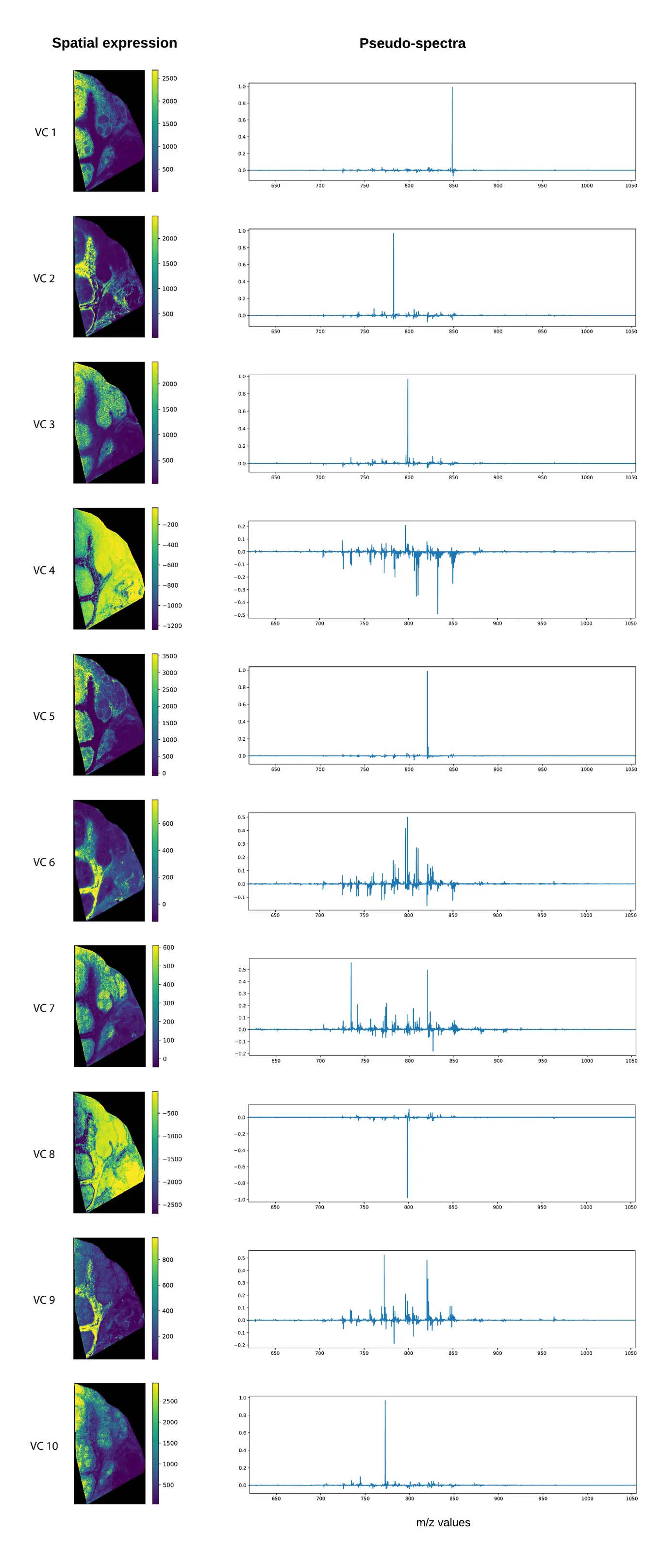
Applied to our MSI data, roughly speaking, maximizing the variance of the squared loadings, means that the algorithm will try to find a rotation, such that there are a lot of loadings with high peaks, and that these high peaks are spread across the different loadings as much as possible. Compared to PCA, this means fewer m/z bins that are non-zero, which greatly improves the interpretability of the loading components.Below, we have applied the Varimax rotation to the first 50 principal components, using the Varimax rotator function in the FactorAnalyzer module. Similar to the PCA results, we plotted the 10 components that we get out of the Varimax rotation. We again get a spatial expression and a pseudo-spectrum, which we plotted for each. As anticipated, the pseudo-spectra for many of the components clearly contain fewer and larger peaks, making the resulting components more readily interpretable. Some of these are now perhaps too sparse to give a proper summarization of the data, however the pseudo-spectra are now much more likely to have the spatial distribution shown on the left.
Using PCA+Varimax involves the following steps:
- Compute the PCA composition with a certain (relatively large) number of components, typically 100-500 though this depends on the dataset and use-case.
- Determine the number of PCs that must be retained (N) to capture sufficient variation within the data, for instance using a Pareto chart as in Figure 5.
- Compute the Varimax rotation on the first N PCs to obtain the new basis (which spans the same subspace as the original N PCs).
Note that steps 1 and 2 are identical to PCA, only the rotation in step 3 is new.
There are two important caveats with using Varimax. First off, unlike PCA, the components are no longer ranked by variance i.e. “importance”, so we would have to look at all 50 components to get a good image of what is going on. Nonetheless, when applying a Varimax rotation to N principal components, the exact same amount of variance is explained as in PCA with N components. Secondly, unlike PCA, Varimax does not have an analytical solution; it is an iterative algorithm, and a global optimum is not guaranteed. This means that running the algorithm multiple times will generally result in different solutions of comparable quality.
Independent Component Analysis (ICA)
For the last algorithm in this post we’ll have a look at Independent Component Analysis, a matrix decomposition technique that originated from the area of blind source separation, and that aims to retrieve the statistically independent components that underlie the observed data. ICA has been used extensively in a wide range of applications, such as facial recognition, fMRI, and remote sensing.
While PCA and ICA are similar in premise, ICA aims to find components that are statistically independent of each other, where PCA requires its components to be “merely” uncorrelated. The requirement by ICA is stronger than that imposed by PCA: if two variables X and Y are statistically independent, they are also uncorrelated, however, uncorrelated variables are not necessarily independent. A similar statistical peculiarity has been featured in xkcd.
As said, ICA originates in blind source separation theory, where a well known example to illustrate the goal at hand is the cocktail party problem. This example, featured in Figure 9, has the premise that a party is held in a room, and microphones are placed around different locations in that room. The microphones all pick up the same party, but microphone 1 is located closer to group of guests 1 than microphone 2. The aim of the algorithm is to find the different “sources” (here e.g. the speakers) from which sound in the party is originating, and reconstruct their original signals (here e.g. the conversations).

This premise differs from that of PCA, which simply aims to find the find the largest variance in the signal picked up by the microphones, which may or may not be the same as separating the different sources and their signals. If a song with a heavy bass is playing in the room, PCA will very likely separate that bass as a separate component, but it might also throw the loud and low-humming aircon in the back together with that bass line in one component. This is not to say that this would never happen in ICA, but in principle it should at least try not to ;).
An additional motivation for using ICA over PCA is that one of the underlying assumptions of PCA is that the underlying variables have a normal distribution, which is generally not true for mass spectrometry imaging data. The intensities of a peak in a mass spectrum are the result of a counting process, and are thus Poisson distributed, rather than normally distributed. Furthermore, biological processes often give rise to non-normally distributed signals (e.g. feedback loops). In fact, most real-life data is not normally distributed, and ICA instead uses such non-normal features of the data to find the underlying signals. ICA algorithms will often use PCA as a preprocessing step to perform dimensionality reduction, and to “whiten” the data, i.e. remove any correlations from it.
Caveats: Similar to Varimax, fastICA does not rank the components and does not have an analytical solution. Likewise a global optimum is not guaranteed and running the algorithm multiple times will generally result in different solutions.
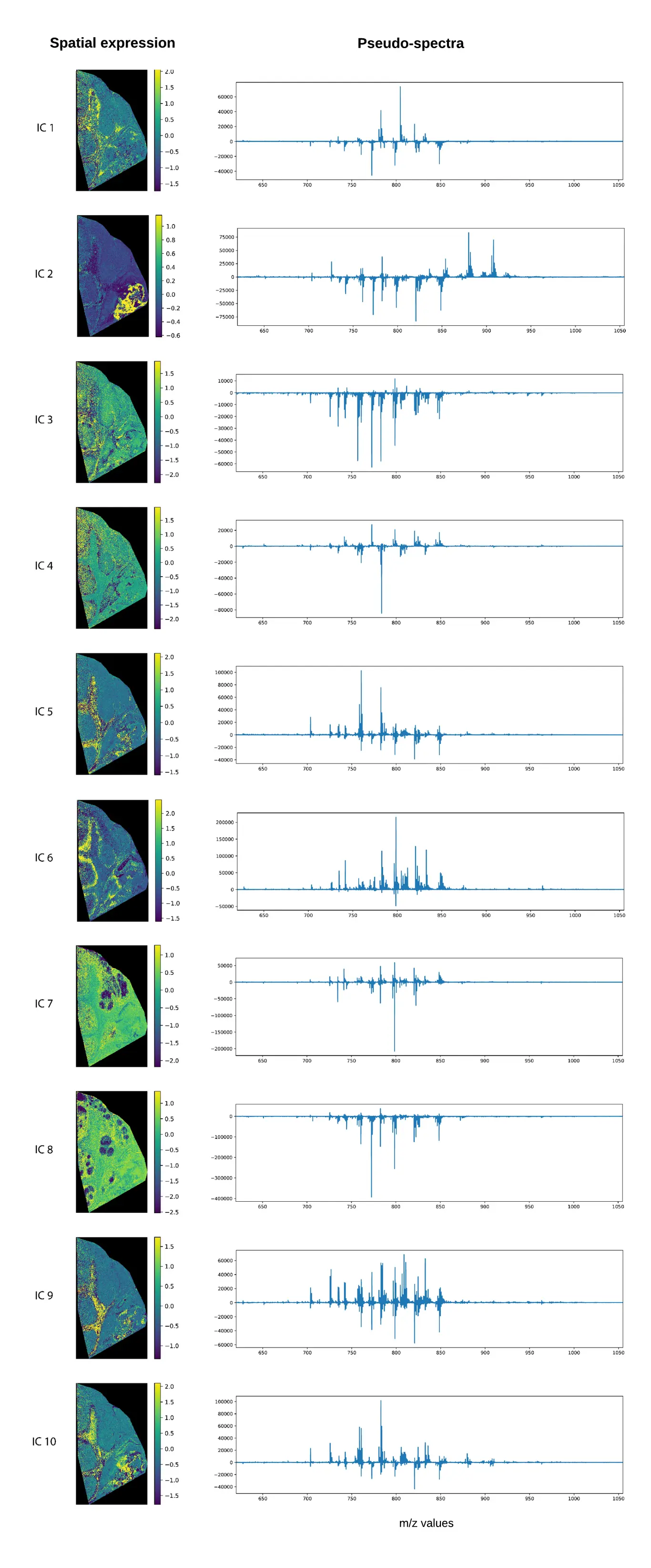
Below we’ve applied the FastICA algorithm available in scikit-learn to our dataset, setting the number of components to 50 based on our variance plot, and the number of iteration per component to 1000. Compared to PCA, the spatial expressions seem to be more focused to specific regions in the tissue. In our results, we saw some spatial structures that did not immediately show up in the PCA and PCA+Varimax decompositions. Something that we’ve observed in the past is that often the ICA pseudo-spectra contain less of a mixture of negative and positive peaks, although this is not very obvious in our current example. While it is difficult to say which decomposition is the better one, without a ground truth, in my PhD thesis (which you can find here). I did some experiments with artificially constructed MSI datasets, where ICA was better at retrieving the original artificial spectra than PCA.
Conclusion
In conclusion, I hope I’ve shown you in this first part how factorization methods can help in extracting the underlying trends from complex mass spectrometry imaging datasets, making this information ready for human consumption. If you have questions, want to know more, or have a project where we can help, please feel free to contact us.